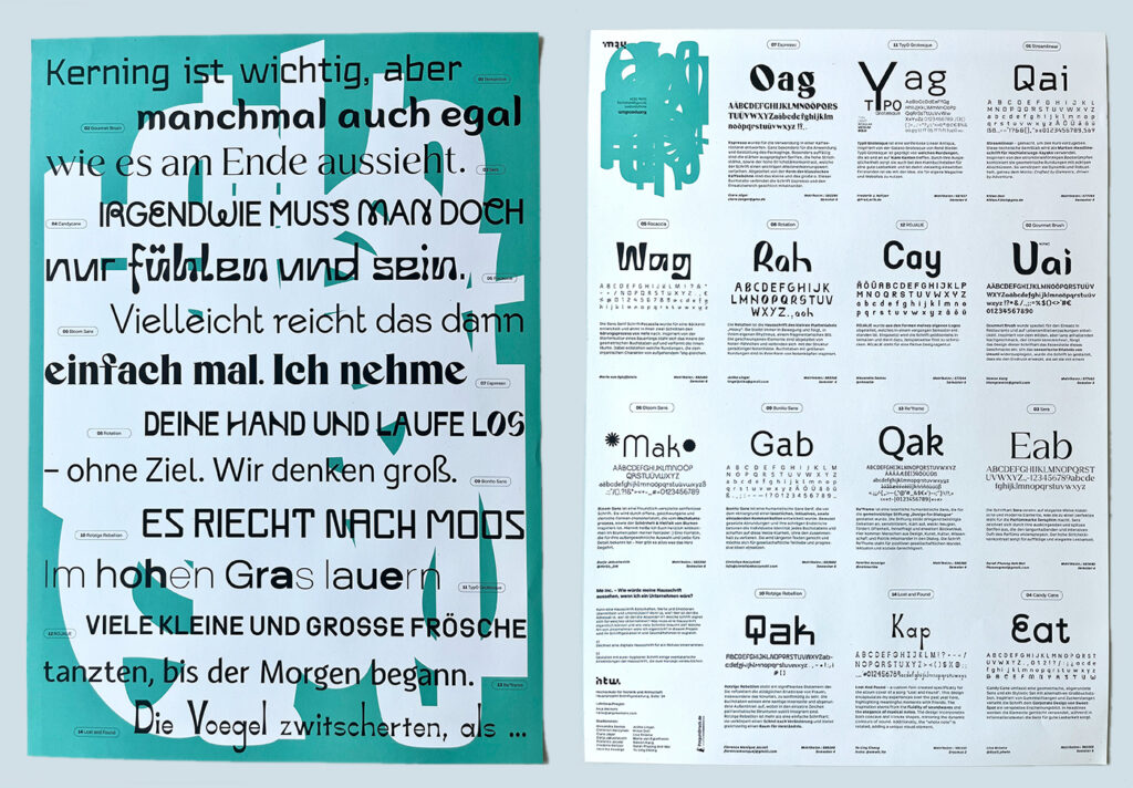
June 2026 – Workshops “Speeddating Typography”
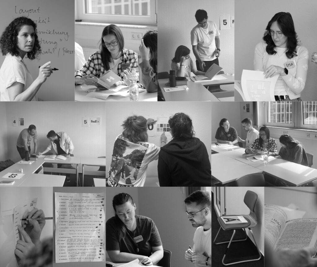
Looking back, it was sort of a crazy idea—but those are sometimes the best ones. It was a lot of fun to take the plunge at DIPLOMA’s D.SIGN Summit and offer a playful workshop concept in two sessions. Over the course of 90 minutes, participants exchanged ideas about typographic design at 20 stations—in pairs. The goal was for them to practice developing a typographic eye and discussing it—specifically, identifying, analyzing, and evaluating under time pressure. Confusion, ambivalence, and feeling overwhelmed were all part of the concept, because after 2 minutes, they were allowed a brief moment to take notes and assign heart-shaped stickers—and then it was off to the next station with a different focus. As the instructor, I stayed in the background (and operated the timer). At the end, the topics and exhibits deemed most interesting were discussed in a plenary session. Here’s a quick look at the top picks: incorrect apostrophes, Helvetica, asemic writing, and the German Basic Law presented in two different media … And what can I say: It was an incredibly exciting and enriching experience! Thank you for participating.
April 2026 – Co-Authorship typography coursebooks
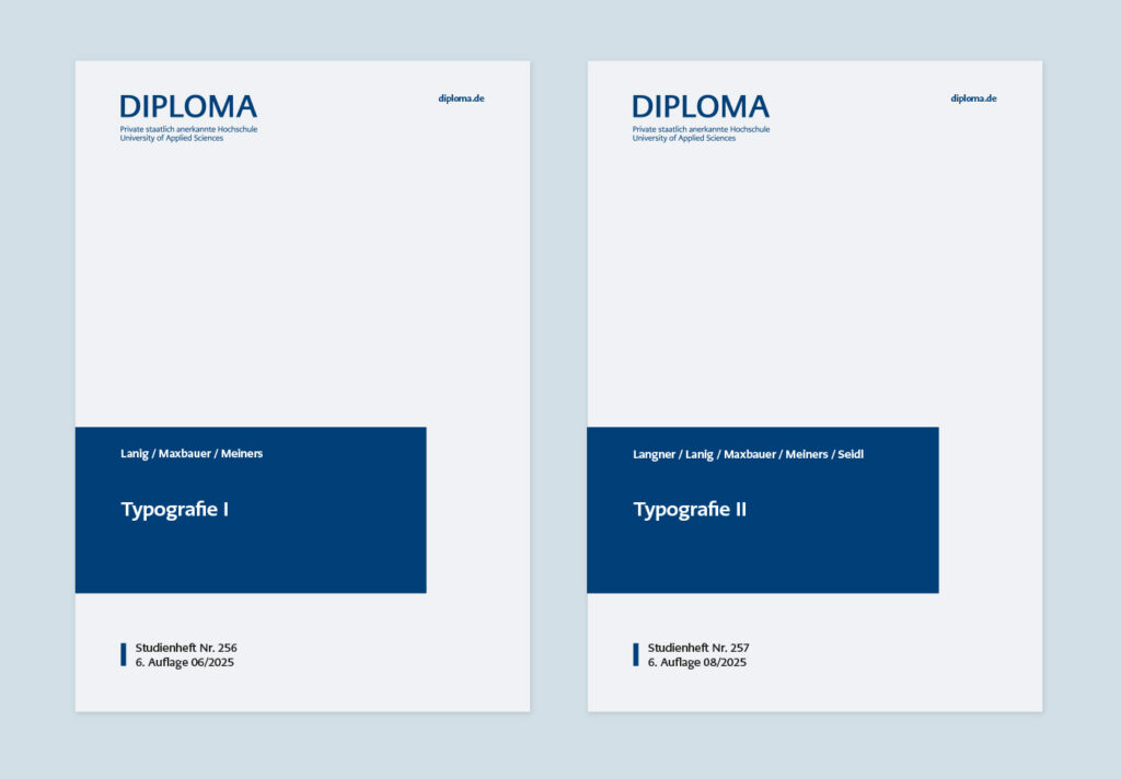
In summer of 2025, even taller stacks of books than usual had been piling up at my workplace for months—and now the result of this “stacking” is available: the commissioned revision and expansion of the distance learning coursebooks on typography for the bachelor’s degree programs at DIPLOMA University. During this iteration, Andreas Maxbauer and I divided up the topics covered in the coursebooks, which both totaled over a hundred pages. My area of responsibility included, among other things, the history of typefaces, typeface classification, the impact and selection of typefaces, the process of reading, typeface design, accessibility, typefaces and the law, and more. It was a very exciting experience to venture into the realm of authorship. This involved adapting course content—which I had previously prepared for in-person classes—into a written, coherent format tailored to the pedagogical framework of distance learning. Many thanks to Andreas Lanig, Dean of the Department of Design & Media, for his trust, and to my co-author Andreas Maxbauer for our excellent collaboration.
January 2026 – Writing about Reading
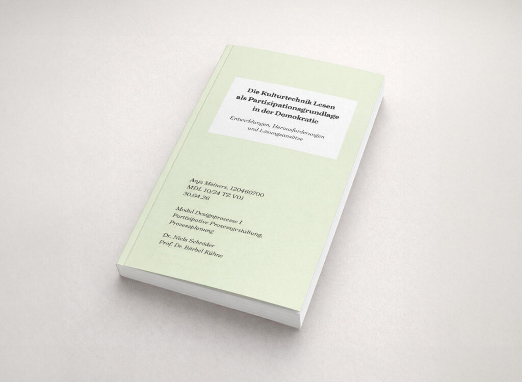
In January, I got carried away with writing. While working on an essay on the subject of reading as a basis for participation, I read some interesting books about reading — and subsequently wrote and drew cartoons about it. Two thoughts among many that are actually quite obvious, but which have the potential to challenge the profession of type design and — more broadly — our everyday lives: cultural techniques do not fall from the sky; they must be nurtured. And: For machine reading, the typeface doesn’t matter.
Book recommendations (German):
Christoph Engemann – Die Zukunft des Lesens (Matthes & Seitz)
Florian Rötzer – Lesen im Zeitalter der Künstlichen Intelligenz (transcript)
December 2025 – Social Christmas
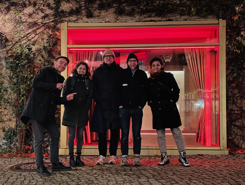
This lovely photo was taken after Jürgen and Martin from supertype hosted a Christmas dinner for their collaborators Golnar Kat Rahmani, Christoph Koeberlin and me. Thank you all — it was a heartwarming end-of-year-evening.
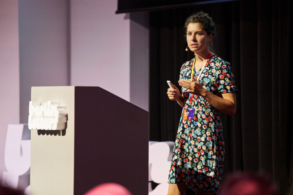
November 2025 – Grey month showing its human side
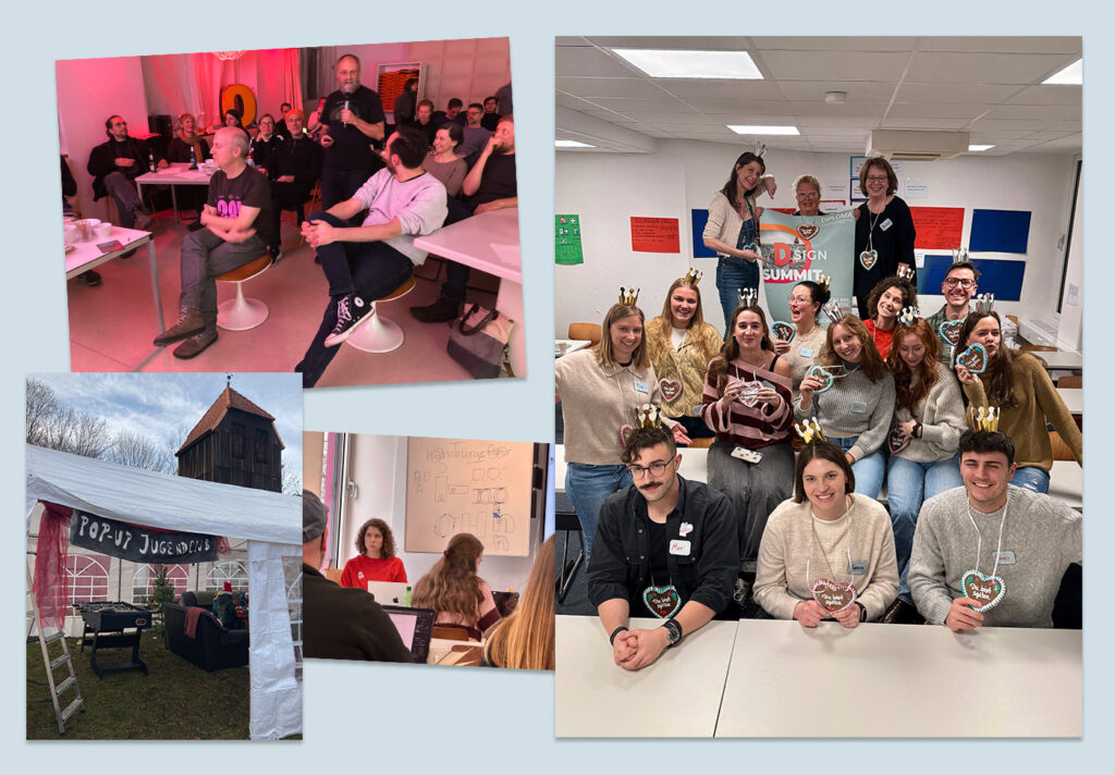
In November, I was in Munich to visit the D.SIGN Summit by the Design Department of DIPLOMA University. On the one hand, we students developed the concept for the event ourselves and met there in person for the first time in most cases. On the other hand, some students, including myself, contributed a workshop to the diverse program. On the topic of “Crash Course: Your First Own Font”, I took participants on a three-hour journey through the phases of a font project. It was great fun and confirmed my observation after two semesters of this Master’s programme: as grateful as I am that online study exists as a format (otherwise I wouldn’t be able to manage it alongside my job and family), personal encouters are ultimately more important than anything else. They hold surprises, warmth, and interest, as well as doubts and at the same time the overcoming of those doubts.
Another trip in November took me to the city of Mainz to visit Hermann Schmidt Verlag – with the little letter book “Spiegelei“ (see September) in my luggage. As part of the Mappentag, selected authors presented their project ideas in a relaxed atmosphere. It was a very valuable experience and I am delighted with the positive and promising feedback on my book, namely to think and distribute the concept in a much bigger and broader sense in terms of promoting early reading. Not many publishers cultivate such an approachable and trusting format as the Mappentag. Many thanks to you, Karin und Bertram Schmidt-Friederichs, as well as the entire Schmidt team for this enriching day!
A similar effect had the joint guessing game at this year’s Typostammquiz and the Christmas market by the “Vereine” here in the small town of Groß Köris, where we set up a pop-up youth club with the Jugenförderverein Groß Köris e.V. What all these episodes in the middle of gray November have in common is the glow of human interaction. May sound cheesy, but what I mean is: go out of the echo chambers and into personal conversation, with acquaintances but above all with strangers, in order to recognize and understand different perspectives!
September 2025 – Mixed News
And just like that, it’s autumn again. Here’s a summary of the most important projects of the last few months:
Super collaborations: Two corporate type projects together with Supertype have been created and are almost complete: A large Script family and a Cyrillic extension to an existing Latin design.
A different kind of teaching experience: Together with Andreas Maxbauer, I took on the task of revising the “Typography I and II” study guides for DIPLOMA University. These works provide comprehensive content for distance learning students on BA programmes. My role included authoring the chapters on history, classification, typeface design, rights, the impression of typefaces, the reading process and accessibility. Some sections were revised, many were rewritten. It was a very intense project, and I am really pleased with the overall result. Thank you to my Typostammtisch colleague Dr. Thomas Maier for sourcing almost every book I could possibly need! And thank you also to Prof. Dr. Andreas Lanig for the trust you placed in me.
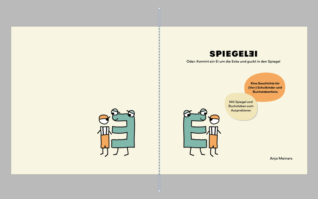
Fun one: During the current semester of my master’s programme, I am busy drawing tiny comic letters that look at themselves in the mirror. Yes, really! I’ve had the book project “Spiegelei” in my head for SO LONG and now I’m finally taking the time to implement it as part of my studies! If you know any children who keep on turning, mirroring and changing letters while learning, then this book is just right for them. Stay tuned.
April 2025 – Tag der Schrift in Zurich
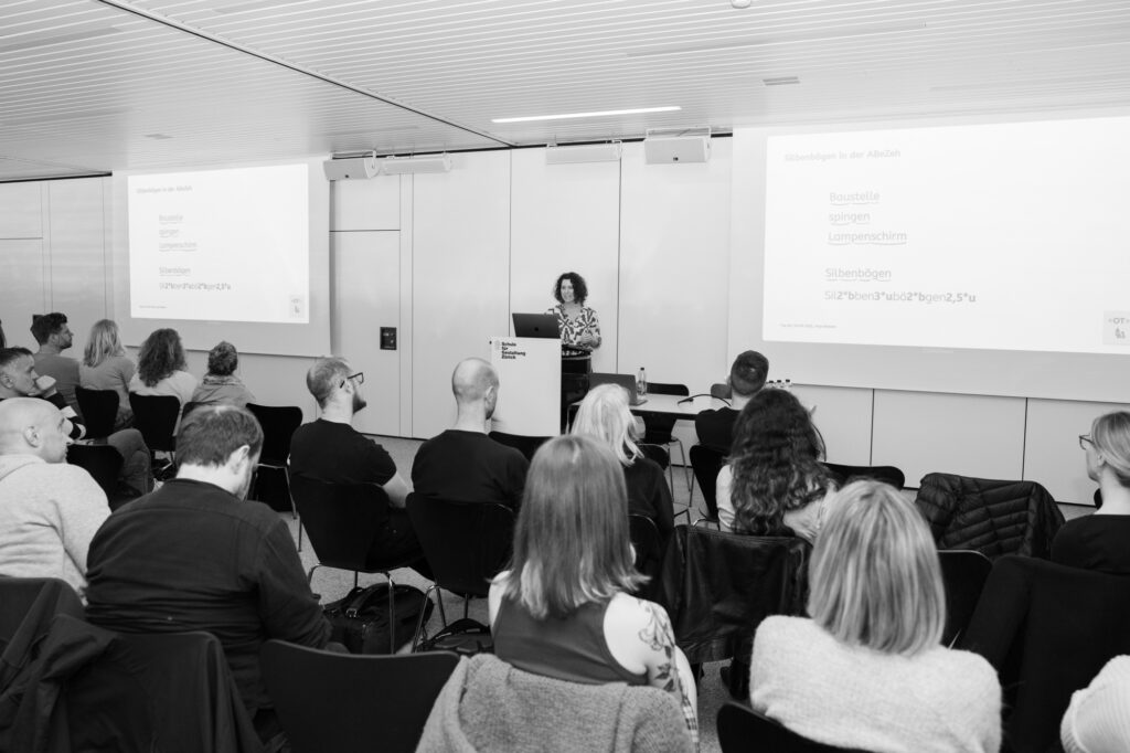
Tag der Schrift is a yearly event at SfGZ in Zurich, Switzerland. I was invited to give a lecture and workshop next to Dafi Kühne, Silvio Meier, Miriam Reichensperger and Stefan Kunz. My topic was how type can contribute to the process of learning how to read and write. The following workshop was called “Let’s talk about Type!“. Participants were invited to bring their typeface drafts to discuss — but it ended up as kind of a universal type Q+A 🙂
A heartfelt thank you for the invitation, the warm welcome and the smooth organisation to Dominique Kerber and his collegues. It was a great pleasure to visit Zurich!
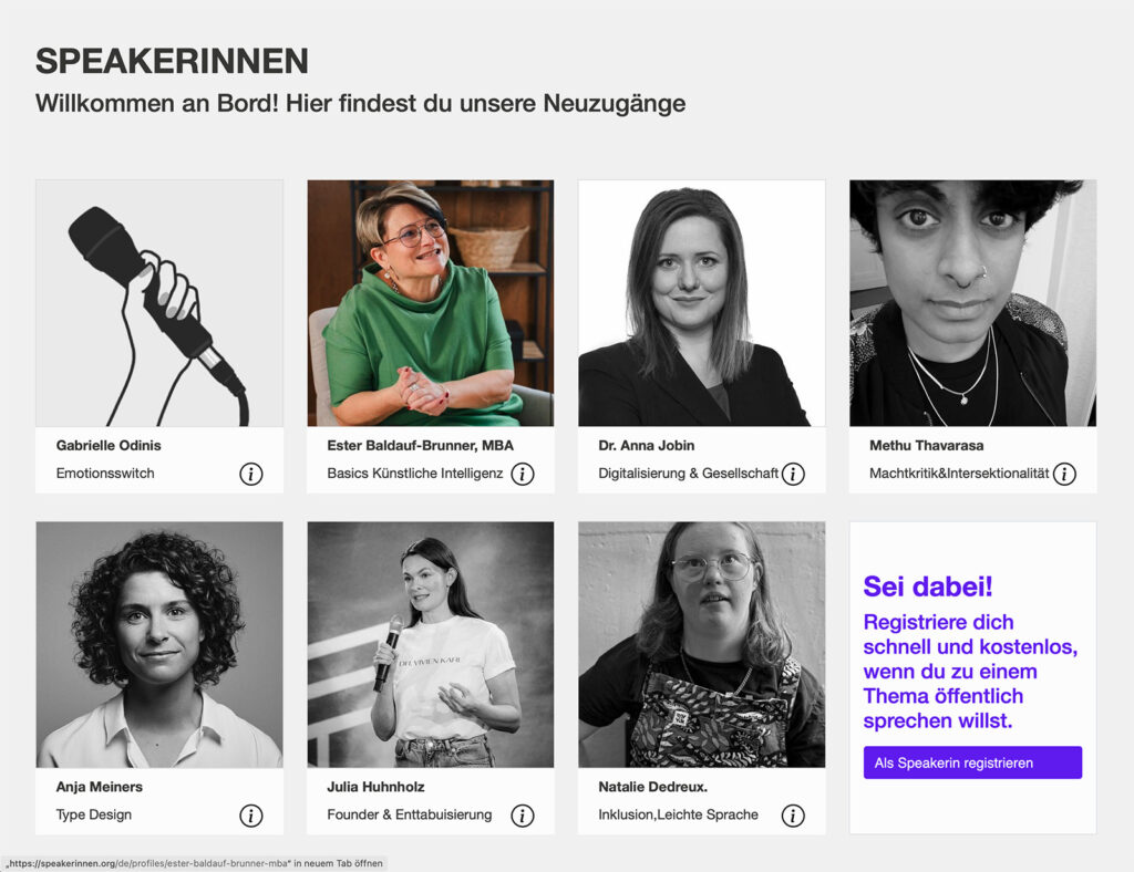
Talking of lectures: In a lot of fields, it is challenging for organisers to bring a diverse crowd of speakers on stage. This is where speakerinnen.org gives a hand by listing female and diverse speakers. Since recently, I’m on board, looking forward to requests. Let’s talk about type!
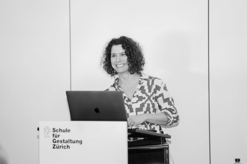
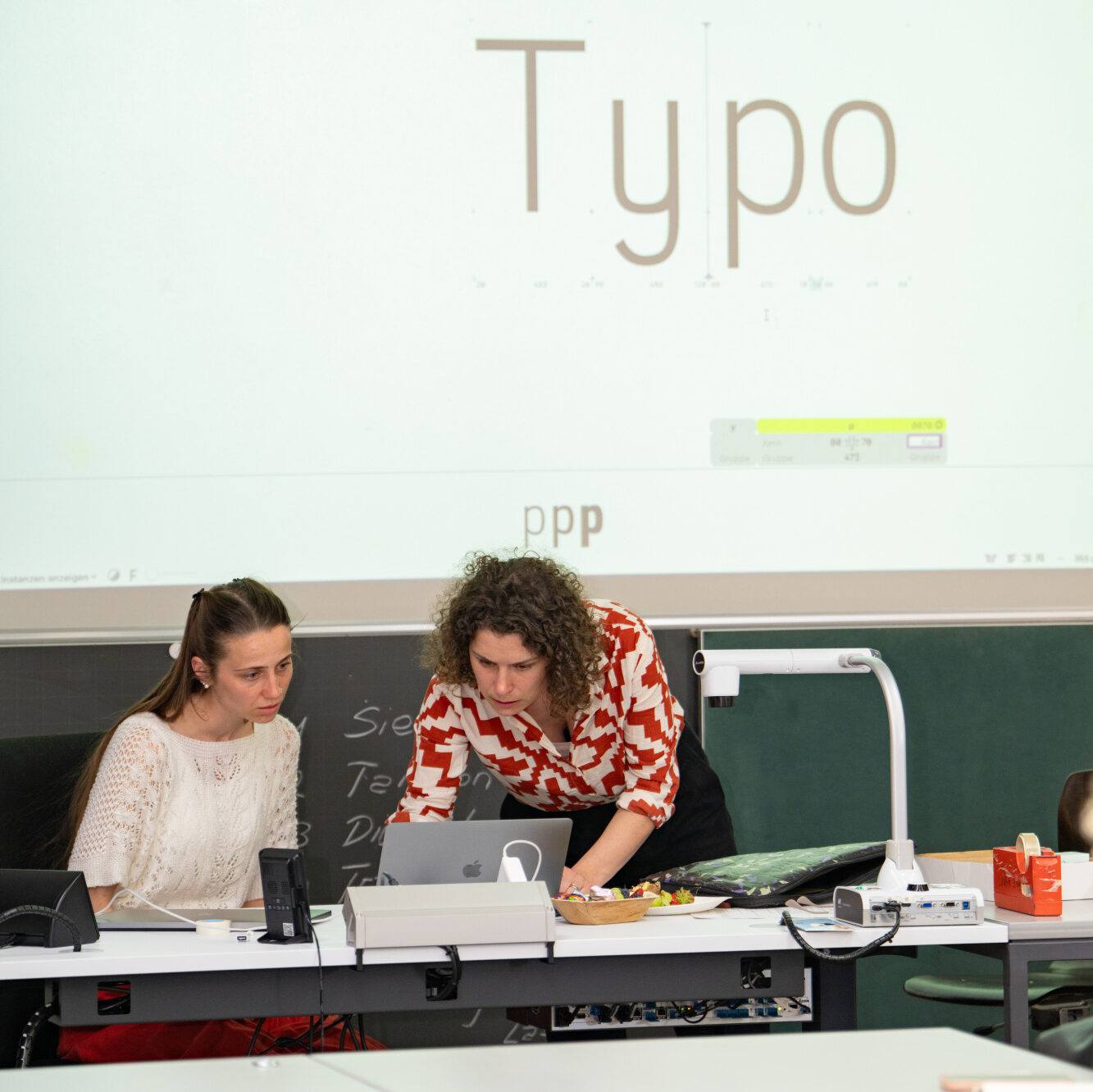
Photos: Siro Hartmann for SfGZ, thanks a lot!
March 2025 – Marie-Annick Le Blanc Logo
I’m gradually getting an expert in designing logos for ceramicists! 🙂 After working with Asta Volkensfeld two years ago, Marie-Annick Le Blanc approached me to create a distinct and classy logo with a profound intention.
Marie-Annick’s work as a ceramicist and artist draws a lot of inspiration from Japanese craft and philosophy. Especially the concept of “Ma”, which stands for empty space and the relationship between shapes and the absence of shapes is important to her. If you think of vases and pots in a philosophical way, this becomes quite evident. We captured this “Ma spirit” in the visual similarity to the Japanese character and combined it with a monogramm of Marie-Annicks prename initals – also MA by chance. The chosen typeface Montserrat is designed by a team in which my Typostammtisch colleague Sol Matas participated. Montserrat offers round alternates for characters such as M, A and N which Marie-Annick always found disturbingly edgy when seeing her name set in capitals. Also, the arched shapes resemble some of her works.
If you happen to look for an inspiring trip into the countryside: Marie-Annick offers Raku and pitfire courses in her idyllic place south of Berlin. Hands-on!
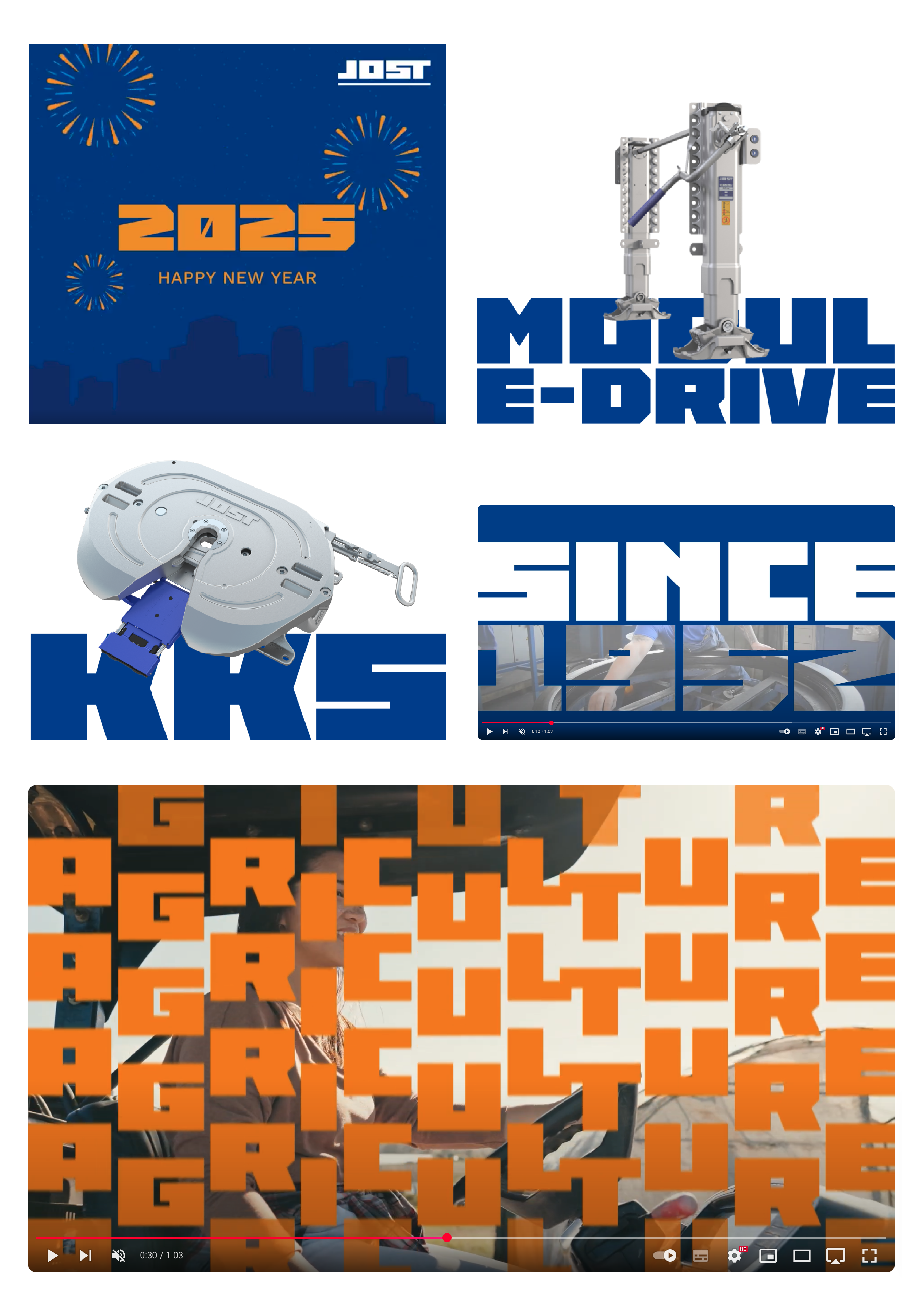
February 2025 – JOST Statement
JOST is a German-based and globally acting manufacturer of systems, modules and components for commercial vehicles. The uppercase alphabet I designed last year out of their existing logotype is now implemented in their corporate communications. During the design process, a radically blocky and reduced statement typeface evolved in cooperation with the agency TWT Engage. The proportions, leading and appearance were all-defined by the logotype. Within the corporate design, we see the massive appearance of the typeface contrasted by rather delicate, masked components or moving elements such as animations and film. Interestingly, the lettershapes work as frames at times. Typographically, it was a rather narrow task. As soon as the typeface is embedded in the corporate design, it works very well in creating a strong brand personality. Always nice to see this process after designing the typeface itself – also kind of a lucky bag 🙂
→ Image film on YouTube
January 2025 – Publix Icons
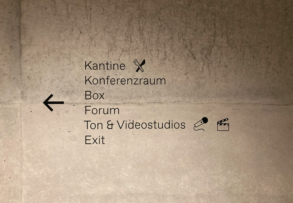
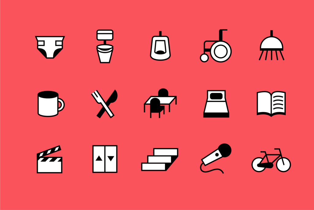
In January, I had the pleasure to visit an event at Publix, a house dedicated to journalism and democracy in Berlin Neukölln. The panel discussion on disinformation was very interesting and a great possibility to meet nice people. Beyond that, the evening was quite special to me because I could have a look at the wayfinding icons we designed in 2024 together with Christoph Rauscher and Village One as an addition to the existing basic icon set of AFF architects. In combination with stunning architecture and a lot of concrete, the icons assimilate well in the corporate design (designed by Village One). I found it quite stylish as a package!
The core task of not showing persons in the icon language lead to rather unseen visualizations, for instance the different types of restrooms or the baby care room. I really enjoyed working on this little system which also comprises different rooms such as telephone boxes, recording studios, overnight rooms and offices.
November 2024 – Stuff
Currently no English version available.
You could switch to German and read about an exihibition in Gemäldegalerie, a “Creative Morning” and a lecture on type design at DIPLOMA I gave …
October 2024 – Student again!
From now on, I’m a student again. In the MA programme “Design & Leadership” at DIPLOMA university, I’m going to get to know thrilling people, concepts, texts and ideas. After 14 years of freelance type design practice, I’m excited to broaden my view and have a look at the big picture including communication psychology, creative writing, project management, creative theories, team development, future studies and loads of design and research.
As this programme is part-time and online, I’m still available for project inquiries. Type is where the heart is, eventually.
August 2024 – Review of teaching in summer term
August means holiday time. Thus, I would like to take the time to recap the summer semester at HTW Berlin from a personal perspective. I was glad to offer a main project with focus on type design. Over three months and with weekly consultation and theoretical input, 14 custom typefaces for different companies, initiatives or associations evolved. We also did a course poster/booklet with a dada poem everybody quite liked. The student’s work was shown at Werkschau in July.
It was a great pleasure to accompany all those students and to see their projects grow and grow – with all ups and downs that naturally belong to the process of (type) design. So dear type people, whenever you come across one of these fabulous students, you should give them support, input and opportunities to grow.
July 2024 – Berlin Letters
I’m still totally flashed thinking about all this exchange, inspiration and great atmosphere at BerlinLetters Festival 2024! A heartfelt thank you to all the people who worked hard to make this possible. The colourful program varied from extraordinary output of haptic things (Lucas de Groot), detailed graphic design for film props (Annie Atkins), and marketing tips for fonts (Ivo Gabrowitsch) to Cyrillic and colonialism (Yana Vekshyna), or local commercial signs of Israel (Liad Shadmi).
My contribution was about type design for beginner readers – which means that I talked about antenna Fs, thing constancy and a type family that is rather a type collection (which will never be finished). Thank you so much for your feedback and impulses. It was a lot of fun!
June 2024 – ROSSMANN corporate typefaces
If you buy shampoo, diapers, cereal bars or similar stuff from time to time, you can have a look at the new ROSSMANN corporate typeface family in stores and the online shop now. I’m happy to have contributed to this design within the TypeMates project team. The result is a friendly, warm and fresh Sans including Condensed and Italic, as well as a Script that adds further design possibilites. This was a true fun project, thank you very much for the great collaboration, Mates! A detailed case study can be found at the TypeMates website.
May 2024 – Movr app icons
I’ve been drawing a lot of icons lately. These ones show 50 different crossfit excercises for the fitness application Movr–App by David Moeller. Personally, I am not able to do half of these excercises, but everybody who’s into crossfit should give David’s app a try. It was a great collaboration and I whish you all the best for the future of your app, David!
Also this month, I was busy doing some graphic design on posters and flyers for local elections which happen in parallel to the European elections here in Brandenburg. It’s a small contribution to democracy and I feel deep respect for the vestrymen and -women actually spending their time and heartblood to keep local politics going. So important!
April 2024 – Workshop at ISB
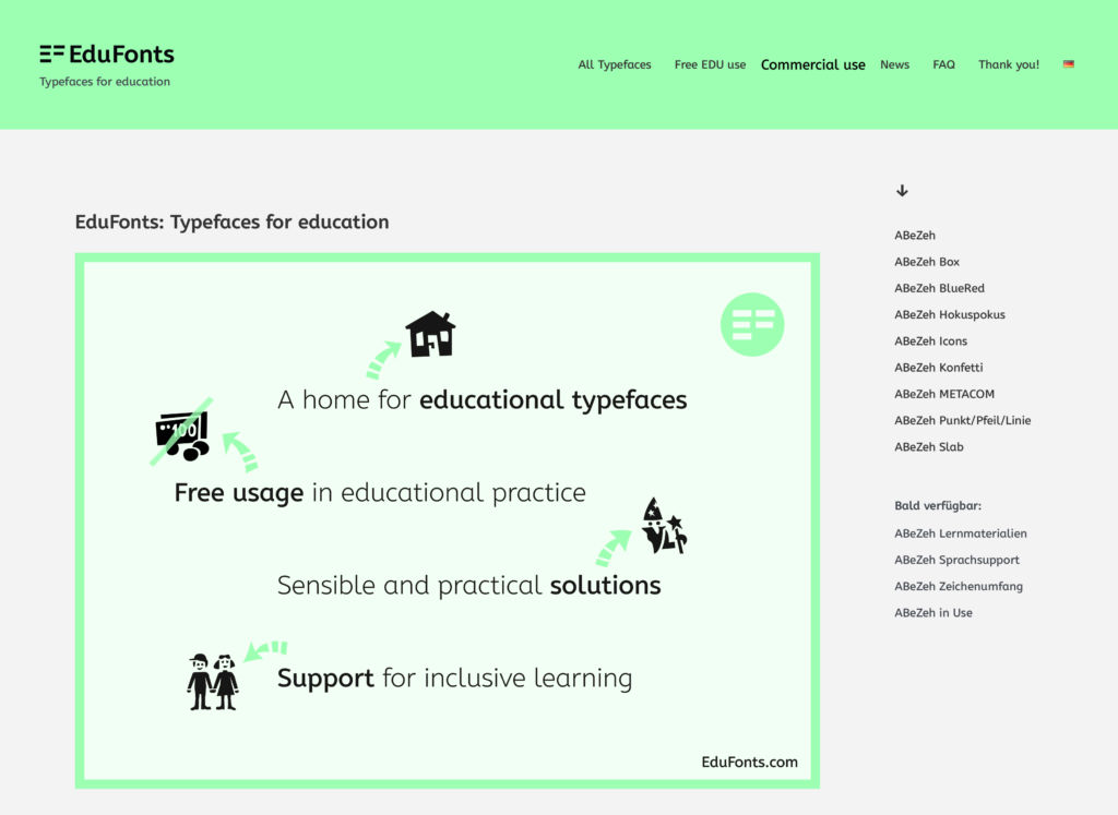
In April I was invited to take part in a workshop at ISB Bayern (Institute for school quality and educational research). We talked about educational typefaces and their implementation in school clouds. Thank you very much for inviting me to this interesting and constructive exchange. Head over to edufonts.com if you are interested in this topic.
March 2024 – Preparing for HTW Berlin
Preparations are ongoing: In summer semester, I will be teaching at HTW University of Applied Sciences Berlin. Prof Jürgen Huber who is taking a research semester, asked me if I’d be interested in offering a main project. I surely am (thanks, Jürgen)!
The task will be: „Me Inc. – How would my corporate typeface look like if I were a company?“. So which notional enterprises will the students found and how will their corporate typefaces look like? What can a corporate typeface do for a company in the first place? I am curious and looking forward to an intense semester!
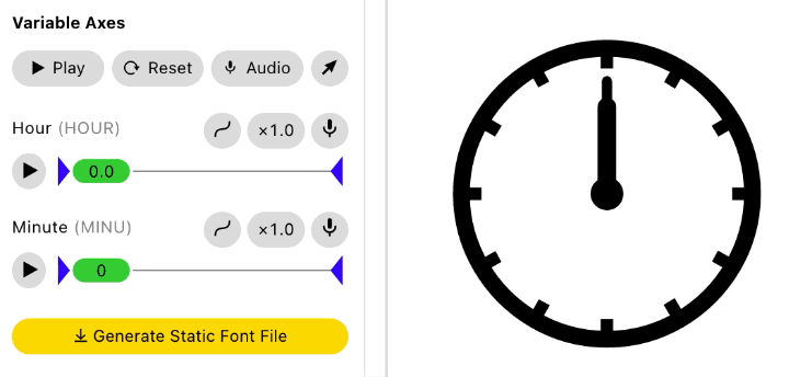
February 2024 – Please welcome: Clocky!
As useful as a chocolate teapot? For the past few weeks, I have been working on a clock as a Variable Font. People who deal with type design will be aware of the problem: interpolating type works on a linear basis but the clock hand rotates and therefor describes a circle as interpolation path. This is called „Higher Order Interpolation“ (HOI) and Underware described it way better and very insightful back in 2018.
Doomed to linear interpolation, I had to deal with a lot of Intermediate Masters and bigger and smaller challenges (thanks Georg Seifert and Rainer Erich Scheichelbauer of Glyphsapp for useful tipps and Dinamo for FontGauntlet, the brilliant testing tool)! A little fortaste: How many degrees will the short hand turn if the long hand proceeds by one minute? You are right: 0.5° (360/12/60) – on a different position depending on the actual time. And please, keep in mind to make provisions to not flip out if someone wants the hand to be thinner, longer or without rounded corners. (Did somebody dare to suggest a third axis for the seconds? It would drive me crazy!)
For which purpose, you might ask? To be honest, the variable font is kind of a playground but in the end the typeface will be able to translate digital time inputs such as 09:24 or 17:59 into analogue clock icons. This can be very useful for learning the clock … Soon at edufonts.com!
January 2024 – Forecast
January promises an interesting New Year: Currently, there is another custom type project of TypeMates I can help with, and a lovely little icon project together with the most wonderful people of Village One. Also an additional lectureship in the summer semester, and the news that I will be speaking at Berlin Letters Festival this summer, opened up. Feels like winter is almost done, folks! Well, almost …
December 2023 – It’s *that* time of the year
The last Typostammtisch Berlin chapter of the year is usually a quiz. For this year’s Typostammquiz, I had the pleasure to take care of the questions together with Andreas Frohloff and Stefan Pabst. It was so much fun and I learned a lot (especially within the field of calligraphy which is Andreas’ favourite topic). The best thing is: You can also have a guess (if you understand some German), because the quiz is prepared interactively on the Typostammtisch website. Have fun!

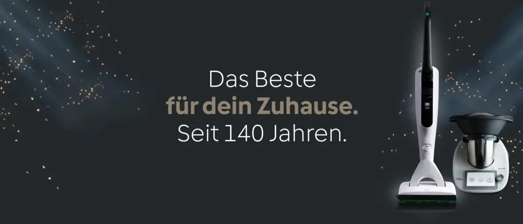
November 2023 – Vorwerk corporate typeface
A project that’s been completed earlier this year is now implemented in more and more touchpoints. Together with and commissioned by Henning Skibbe (Character Type), we have developed a custom typeface family for Vorwerk, a German producer of household appliances with long-standing tradition (Thermomix®, Kobold®). The briefing aimed at a distinct geometric design that is nearly as space efficient as Roboto and comprises the same amount of characters. Thank you Henning, I really enjoyed collaborating over 3 months. Learn more about the project in Character Type’s case study.
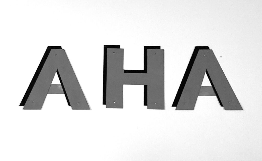
Ooctober 2023 – Co-working
I’m happy to join co-working space “AHA” in Berlin for some days a week next to working from home. Very much looking forward to exchange ideas with the new office people (hi Ulrike, hi Christian!). I think this step will bring more coincidence and interaction into my daily routine. By the way: in German “aha” means something like “uh-huh” or “I see”. Good vibes.
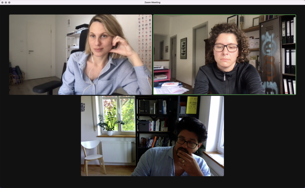
August/September 2023 – Meetups with Mates
Over the last six weeks, I have been working closely with Natalie, Jakob and Nils of TypeMates on a custom type project of theirs. Stay tuned, it will be very visible early next year. Despite my facial expression on the zoom screenshot, it was such a nice collaboration and I really enjoyed working with the team. It gives a lot of insights on new ways of approaching projects, solutions and communication. Thank you, Mates!
July 2023 – Use “Cases”
This month I’d like to share some of my favourite use cases of our Case typeface.
The logo I did for my dear friend and neighbour Asta Volkensfeld is set in Case with customized K. The signet refers to cups and sculptures as well as to Asta’s initials A and V. Make sure to check out her beautiful ceramics and textile art.
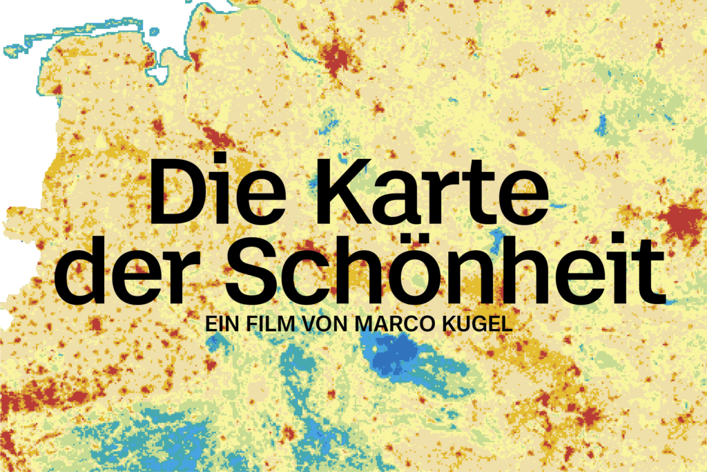
The documentary Die Karte der Schönheit (“The Map of Beauty”) explores the beauty of landscapes in economical and political contexts. Case Micro accompanies the viewer throughout the whole film. Highly educative, mind-opening and relaxing to watch (slow TV)!
Find more use cases at Fontwerk.
June 2023 – Case 2.0 release
Case 2.0 in cooperation with Ralph du Carrois and Erik Spiekermann has been released at Fontwerk. Our latest take on the typeface system enlarges the weight range (fatfatfat!) and adds Cyrillic, Greek and Vietnamese plus a lovely UniCASE feature to play with. With its 3 families (Case, Case Text and Case Micro), it’s more than suitable for large branding projects. Familarity with a twist, versatile in every condition.
But read more and test the fonts over at Fontwerk …
May 2023 – Edufonts.com
EduFonts.com, a new portal for learning typefaces I was working on during the last months, is launching soon. Browse the BETA version: